When I say the greatest in Arizona sports history, what comes to mind?
For some Charles Barkley will be the first thought. Others will say Randy Johnson, Connie Hawkins, Larry Fitzgerald or maybe even a handful may say Shane Doan.
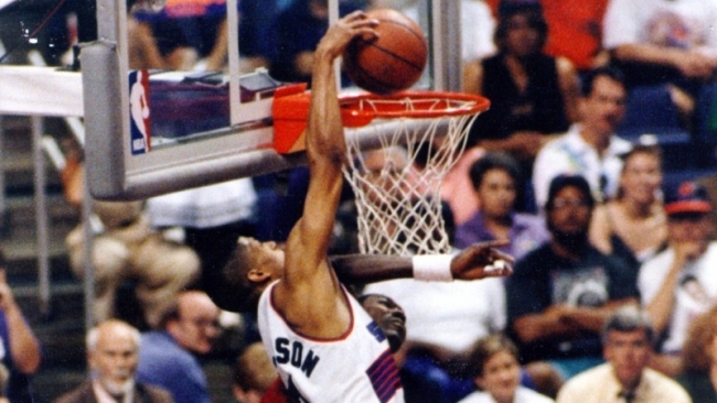
Like a very special episode of Full House, I’m a little different than most. For me, when I hear that, I instantly think of the Suns jerseys from the mid-1990s. How much do I love them? I actually have two full authentic uniforms, shorts included, in my home office.
But how did the most recognizable and memorable threads in Arizona sports history come about? It’s a questions I’ve always wondered. What was the story behind a design that was about as far from pulling a Melania Trump — copying someone else — as any jersey in sports history? Those are questions I’ve wondered since I was a young Suns fan growing up watching Barkley, Majerle, KJ and the Purple Gang from Phoenix. I decided to finally get the answers from those who actually were involved in designing, approving and wearing the uniforms.
I caught up with Tom Ambrose former Suns Vice President and the man tasked with finding the Suns new look in 1992, Tom O’Grady formerly of the NBA design team and in charge of designing the sunburst jersey and Mark West who was one of the first players to wear the new uniform.
Tom Ambrose:“[In 1991] Jerry Colangelo wanted more than just a new arena. He wanted a new approach, a modern style to match the new home of the Suns. He wanted to ditch the old western font. He wanted to see a new attitude and a new look for the “Purple Gang.”
I don’t know why the responsibility for uniforms and warm-ups fell on me as a newly minted vice president, but I was honored that it did.”
Tom O’Grady: My internal NBA nickname was LOGOMAN and I saved my New Jersey license plates which read the same (true story). In all seriousness, beginning with the Suns, Knicks and Bucks rebrands around 1991, I was the creative director either designing the individual identities myself, or overseeing contracted design agencies to provide creative work developed from NBA creative briefs. I would craft and run through NBA Properties President Rick Welts and NBA Vice President of Team Services Paula Hanson at the time.
I remember the process like it was yesterday. I flew out to Phoenix to meet with Jerry Colangelo, Tom Ambrose and Rich Dozier to understand their goals and objectives for the update. Jerry took an immediate liking to me as he heard my Chicago accent and was like, ‘a Chicago-guy will get this’… LOL. The change was timed to the new America West Arena building and the Suns felt this was an opportune time to refresh their identity and take the new colors and select the seating and the arena decor to match the new identity. It was very smart and very appropriate in my opinion. Jerry’s challenge to me was to create a new logo and new uniforms that would convey both energy and excitement but not be too busy nor overly trendy.”
Ambrose: “I did some research on colors. I found out that the original Suns colors, purple and orange, were considered to be “festival colors,” not to be taken seriously. Conversely, blue and black are considered “sincere” and “professional.”
Having done this research, I proposed a Suns color change to a very sincere, dark blue trimmed with silver. But that was quickly shot down. The original selection of the team’s colors in 1968 were based on the purple and orange hues of those sensational Arizona sunsets. Symbolically, you can’t argue with that.”
O’Grady: “I got to work and rendered a wide series of over-sized Suns color pencil sketches (that sometimes appear on Google) using the familiar purple and orange, but with the addition of black into the existing color scheme. One of the designs: a streaking sun would become the direction that Jerry and the Suns really liked.”
Ambrose: “That was one adjustment that we made. We want it to be pointed up. On the original logo it was just kind of there and on one side. We didn’t want it going down like it was setting.”
O’Grady: “The one big change from my original sketch was that I had the sun located on the lower right area of the jersey and Jerry and Tom Ambrose asked for the sun super graphic to be streaking upwards. A great comment to say the least.”
Ambrose: “There were some designs, from groups other than the NBA and O’Grady, that almost had a goth sort of look. Medieval sort of lettering. Some strange ones that didn’t get traction. We went with the sun burst look.”
O’Grady: “From there, we went through an arduous process of figuring out the best way to produce the jersey since it would be impossible to sew or embroider such a large graphic on a basketball tank top.
At this time, the Mac had really taken hold of how graphic designers would work. Adobe software programs such as Illustrator and Photoshop were becoming the new way of designing (remember this is 1991—and technology was primitive compared to 25 years later!)… We used a Champion Sportswear vendor, Holt Manufacturing, to assist us with “sublimating” the super graphics on the new Suns uniforms. Sublimation is now very commonplace but back then we were innovating how teams could apply Photoshop graphics onto mesh material. It was a great and interesting era for uniform innovation.”
Ambrose: “We were worried traditionalists wouldn’t like it but we thought most would like it as a futuristic feel. One of the influences was Portland. It looked kind of similar but included the sunburst.”
O’Grady: “I was nervous about the jerseys fitting so many different sized players, from 7’7″ to 5’4” players at the time. My fear was that the Suns graphic would not have a common “sweet spot” on all these different sized and shaped players. Alas, it was not an issue, and once I saw Charles Barkley in the new uniforms, I was struck on how cool they were and how the designs fundamentally broke new branding ground for our teams.”
Mark West: “My first impression was that the new uniform looks great! I was glad to be in a new uniform and in a new arena. With Charles Barkley onboard I felt that we were bringing in a new era of Suns basketball. We were a very good team, but with the changes in venue, personnel, and uniforms; I thought we were going to another level. The sunburst on the front of the jersey just sort of helped to make that, “HERE WE COME” , statement.”
Ambrose: “It signaled a loosening of traditional NBA styles which had seen only minor changes for many years. Oh sure, there were exceptions like the Knicks’ experiment with a “Big Apple” design on their uniform shorts, but generally speaking, teams like the Suns and Celtics stayed very close to their original, conservative, uniform designs.”
Ambrose: “We had the warm-ups coming. It was maybe two weeks to go before the season. They came in and the orange color was kind of yellow. We made all sorts of changes at that point.”
There were some anxious moments with the arrival of the new uniforms. The team wore their old western-font for all the preseason games, even those played at America West Arena.”
West: “I guess I never thought about why we didn’t wear the new uniforms in preseason. As players, in training camp, you’re locked into preparing for the season, and you’re happy with the old uniforms (seeing that they evolved from the hot pants look). When the new uniforms came out, we knew that the whole organization felt that this team is special and we were the favorites to take the Western Conference.”
Ambrose: “As the preseason came to a close, the new threads hadn’t arrived from the manufacturer. Some uniforms arrived the day before the first game, but many were sized incorrectly. The rest showed up the day of the season opener. Suns athletic trainer Joe Proski had to scramble to get many of the uniforms custom tailored before they could be worn.
In spite of the anxiety, the first regular season game at AWA went off with rave reviews. The Suns had a new power forward in Charles Barkley, a new, sold out arena in downtown and a new, modern look for their uniforms.”
Ambrose: “After two years with our new uniforms the NBA allowed us to add on an alternative road uniform and we selected black as the base color, with purple and orange trim. It was a sincere choice.”

O’Grady: “I have sketches of an orange version of the jersey but the NBA freaked out. They thought fans would need sunglasses indoors! The orange jersey and a streaking Suns ball had a black eclipse type back shadow behind it and we literally were going to call the jersey the Eclipse.
The Suns already had white, purple and black alternates and the NBA wanted to limit the amount of options teams had to reduce operations nightmares and trainers’ confusion at the time since we were changing so many team identities. That’s why they didn’t do them.”

West: “It was a great looking jersey because of the design, and some of the most popular players in Suns history wore the jersey (Barkley, Chambers, KJ, Majerle, Nash)! A lot of popular players that had a lot of success, both going to the NBA finals and to the conference finals, donned the jersey!
I still get some of my family and friends asking for the jersey, especially in the black! I tell them it’s easier to find a unicorn than it is to find a black No. 41 sunburst Suns jersey!”
O’Grady: “The Phoenix Suns entire rebrand is still at the top of my all-time favorites list. It’s very gratifying to see the popularity of the Suns identity which was created over a quarter century ago still be a fan favorite today. When the team introduced the new faux-streaking SUNS identity so many of the comments were… “Please, just go back to the original KJ/Barkley/Thunder Dan uniforms and call it a day…” I hate to be a homer… but I agree. Today, the overall program looks as modern and fresh as it did 25 years ago. Mr. Colangelo’s goal to create a timeless identity was accomplished.”
Related posts:
Greg Esposito
Espo is a Valley sports fan who has been lucky enough to write for numerous outlets about the teams he loves. His opinions are sarcastic but all come from that special place in his heart for Arizona sports.


